Unearthing NASA's 'Worm': Reissue of Manual Celebrates Retired NASA Logo
A 40-year-old book that gave rise to one of NASA's most iconic logos is being relaunched as a limited edition reprint on Kickstarter.
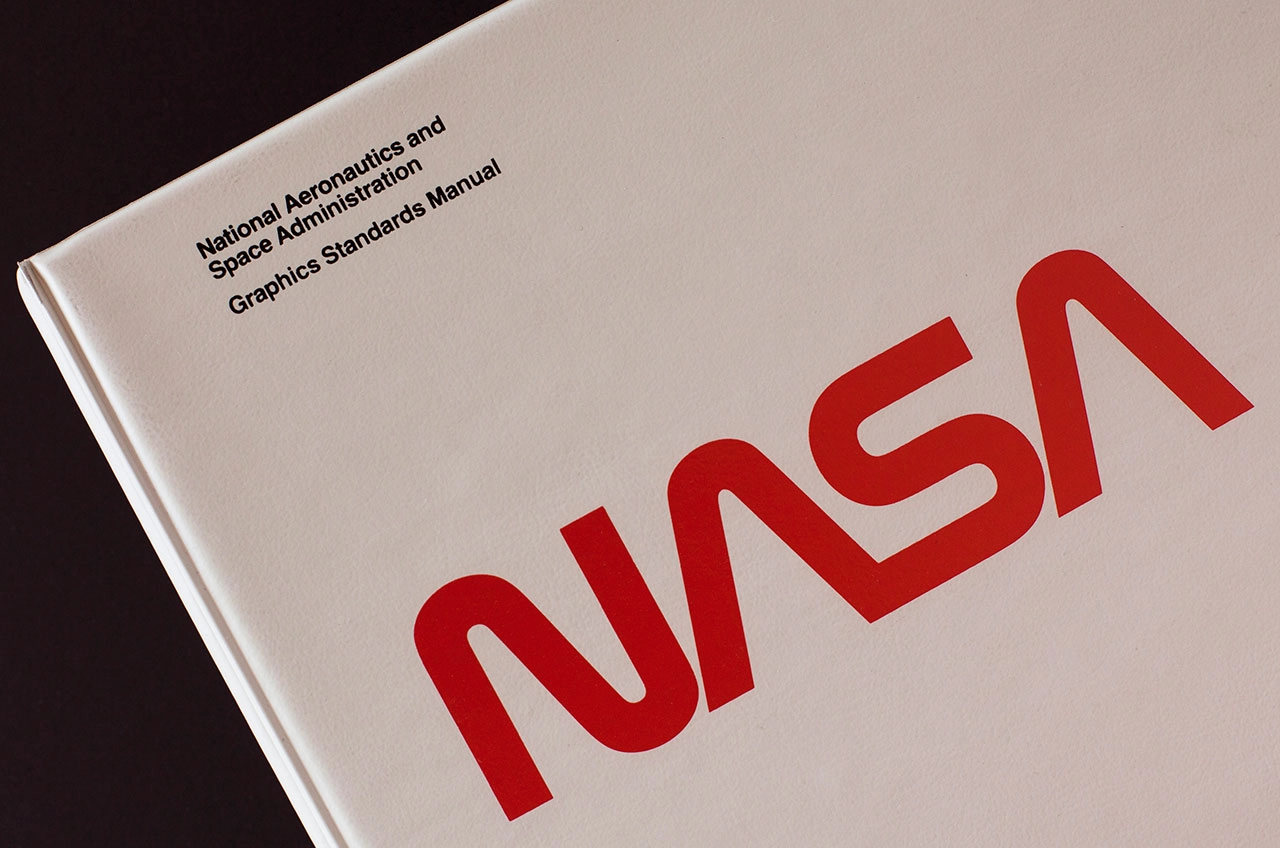
The NASA Graphics Standards Manual, first published in January 1976, defined a new graphic identity for the U.S. space agency. As designed by Richard Danne and Bruce Blackburn, the guide introduced a stark logotype, on which the letters "N-A-S-A" were "reduced to their simplest form, replacing the red, white and blue circular emblem with the white block letters," as Danne's original introduction to the book described.
The manual debuted the planned deployment of the NASA "worm," an affectionate or derogatory unofficial nickname, depending on the viewer's perspective, taking the place of the "meatball," the space agency's first insignia. The red-letter, stylized logotype was front and center for the first decade of the space shuttle program, emblazoned on the wings of the orbiters, the astronauts' spacesuits, and even the body of the Hubble Space Telescope. [Photos: NASA's Offbeat Mission Posters]
And then in 1992, at the singular order of the then-head of NASA, the worm was rejected and the meatball restored.
Now, two designers who grew up knowing the worm as the only symbol that represented NASA are seeking to reprint the Graphics Standards Manual, to honor what Danne and Blackburn achieved and to ensure that the legacy of the worm is preserved.
"We're really looking at this as an archival project to really preserve this document so that it can be seen by graphic designers, space enthusiasts and by people who can learn from the manual," remarked Jesse Reed, who with fellow designer Hamish Smyth is behind the crowd-funding effort that began on Tuesday morning (Sept. 1).
The pair's 34-day Kickstarter campaignis offering a hard-bound copy of the original manual, supplemented with files from Danne's own archives, for $79. For the project to go into print, Reed and Smyth need pledges for 2,000 copies of the book, raising at least $158,000.
"We're really only offering the book as a reward in support of the campaign," Reed said. "We are not doing packages of items or collectibles. It is really just about the book."
Reed and Smyth, who work as associate partners for the design firm Pentagram, have experience reissuing a style guide through Kickstarter. Last year, their first campaign rocketed to more than $800,000 — eight times more than what they had set as their goal — for a new reprint of the 1970 New York City Transit Authority Graphics Standards Manual, the design reference that solved how to find the way around on the city's underground subway. [Related: How Crowdfunding is Helping Space Projects]
Like the NYCTA book, the NASA manual has become one of the world's classic examples of modern design.
"From a graphic designer's perspective, this document is a very good example of systematic design and the way to take what was a mess of graphic identity and really strip that all away, creating this very analytical system on how to communicate what type of agency NASA is," described Reed.
Reed and Smyth plan to reproduce the manual in full-scale within the 200 pages of the limited edition reissue.
"Every page of the manual will be completely included. It'll appear exactly as it appeared in the manual," Reed said. "Nothing about the design will be altered in any way."
The most noticeable difference between the 1976 manual and the reissue will be the binding. The original, like most graphics standards manuals of its day, was held together in a ring binder so pages could be taken out and replaced as updates were made.
The new hardcover reissue will include 10 fold-out pages (gatefolds) and will be packaged in a static shield pouch ("like space hardware or computer parts use," Reed said).
The new edition will also include extra content before and after the pages of the vintage manual.
"What we are doing is including an essay at the beginning of the book written by Christopher Bananos, who writes for New York Magazine. He'll be doing a historical introduction to NASA, the culture of the administration and the socio-economic view within the country during that period," Reed told collectSPACE.com.
"Additionally, Richard [Danne] has given us all of his other supplementary material, including the original presentation that he gave to NASA to propose this new identity," Reed said. "We also have all of these amazing photographs of the shuttle, space food, of [the worm] actually being used in space, that will be included in the book as well."
Reed and Hamish, as self-described "design nerds," hold the original NASA graphics manual in high regard as "a beautiful example of rational, systematic design." Initially, after the success of their NYCTA reprint in 2014, they had no plans to take on a similar project but were attracted by what the worm represented.

"I think what is great about the worm logo is that it visually communicates what NASA does. It really communicates the idea of streamlining and interconnectivity without any frivolous or extra components that are not necessary to do the job," said Reed. "I think that is what the worm does."
"When you look at it, the reason I think that most people like it from a subconscious point of view, is that it actually look likes space," he said.
Watch a video about the NASA Graphics Standards Manual, its history and legacy, at collectSPACE.
Follow collectSPACE.com on Facebook and on Twitter at @collectSPACE. Copyright 2015 collectSPACE.com. All rights reserved.