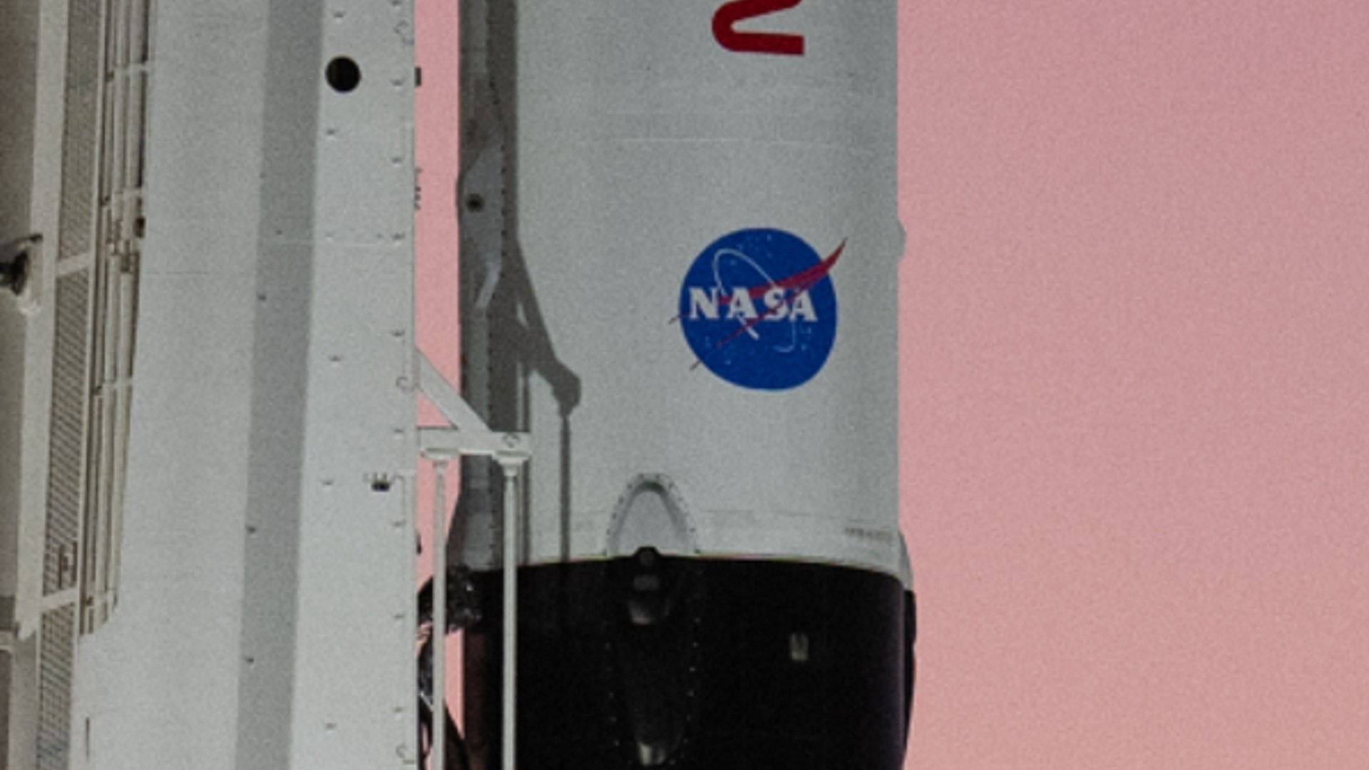
Meatball mishap: SpaceX Crew-5 astronaut launch marked by distorted NASA logo
SpaceX can be forgiven for feeling a bit stretched, but not so much for NASA's iconic 'meatball' logo.

Breaking space news, the latest updates on rocket launches, skywatching events and more!
You are now subscribed
Your newsletter sign-up was successful
Want to add more newsletters?
With crewed launches, Starlink missions, reusing rockets and attempting to get Starship ready for launch, SpaceX can be forgiven for feeling a bit stretched. So too was the NASA meatball logo on SpaceX's recent Crew-5 launch to the ISS, eagle-eyed observers discovered.
The historic mission launched successfully on Oct. 5 and saw a Russian launched to orbit with SpaceX for the first time, despite severe geopolitical tensions in the wake of the ongong Russian invasion of Ukraine.
Yet the rocket sitting on the pad drew attention for other reasons too. NASA's iconic round red, white and blue insignia, nicknamed the "meatball," appeared to be oddly out of proportion and distorted on the side of the SpaceX Falcon 9 rocket that launched Crew-5 to the International Space Station (ISS). Naturally, the internet jumped at the opportunity to poke fun at it.
Related: SpaceX astronaut missions for NASA: Crew-5 live updates
"Wait … what … what happened to Crew-5's meatball?" tweeted Florida Today space reporter Emre Kelly, noted Creative Bloq.
Wait…what…what happened to Crew-5’s meatball? pic.twitter.com/JiXJuYRFgE
Creative Bloq picked up a flurry of tweets on the matter, with users poking fun at the apparently hand-painted NASA logo which, unlike the launch itself, seemed to have veered off course.
pic.twitter.com/1mDVWB9Umd
the new nasa logo https://t.co/8gjFp7P0Ib pic.twitter.com/k2wnlprVJY
The "meatball" logo first appeared in 1959 and served as NASA's official logo until 1975 when the red "worm" became NASA's emblem. According to the agency, the logo's overall round shape represents a planet, while the stars obviously represent space. Meanwhile, the red v-shaped wing design represents aeronautics, and the circular orbit around the agency's name is meant to stand for space travel.
Breaking space news, the latest updates on rocket launches, skywatching events and more!
Perhaps the Crew-5 logo was a subtle nod to the fact our planet is an oblate spheroid, slightly flattened at the poles due to Earth's rotation, but likely not. It's unknown what caused the logo to appear so out of sorts.
It's not the only recent space-related logo fiasco, however, as a flying saucer-shape turned up on a National Intelligence Manager for Aviation logo. (That logo has since been taken down, and a spokesperson there stated that a staffer had "erroneously posted an unofficial and incorrect logo.")
Follow us on Twitter @Spacedotcom or on Facebook.

Andrew is a freelance space journalist with a focus on reporting on China's rapidly growing space sector. He began writing for Space.com in 2019 and writes for SpaceNews, IEEE Spectrum, National Geographic, Sky & Telescope, New Scientist and others. Andrew first caught the space bug when, as a youngster, he saw Voyager images of other worlds in our solar system for the first time. Away from space, Andrew enjoys trail running in the forests of Finland. You can follow him on Twitter @AJ_FI.

