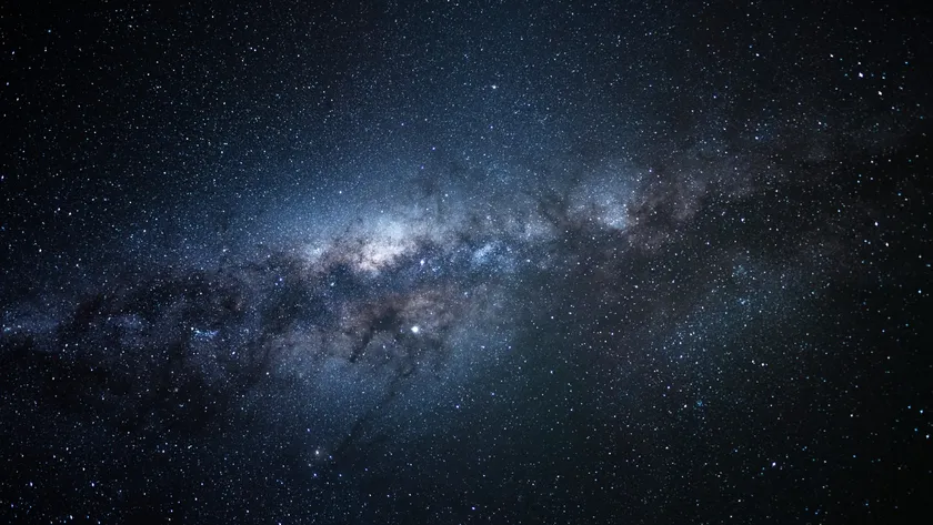
The second "A"
in ATA stands for array, meaning that this instrument is made of many small
dishes. Although each dish is as big as a house, they are small compared to the
complete telescope: ten city blocks on a side. The bigger the telescope, the
more detail you see in the images. By breaking up our collecting area into
hundreds of small pieces, we capture detail as if we had a telescope the size
of a subdivision for the price of a single apartment building.
But detail
isn't everything. Consider the following example, based on a well-known image
by Leonardo
da Vinci. Starting with the painting (Fig. 1, left), we deconstruct the
Mona Lisa into two parts: one containing all the details of the image, and one
containing the coarse structures. The upper right image contains the details,
or as we say in radio astronomy, the high spatial frequencies of the image.
Most of the beauty of the painting is found here. In case you've never noticed,
this image brings out the nature behind Lisa's head, with trees and a flowing
creek.
But the
detail image is gray and blah compared to the original painting. What gives the
painting its punch are the low spatial frequencies, represented at bottom
right. This image makes you reach for your glasses, and by itself is
uninteresting or even ugly. It is only when you add the two right-hand images
together that we see the full complexity and brilliance of the original
painting.
Getting
back to the ATA [Allen Telescope
Array], when we run the telescope in array mode, we capture all the high
spatial frequencies of the night sky, much like the detail image of the Mona
Lisa in Figure 1. This is done by comparing radio signals two-by-two for each
pair of dishes in the array. With 350 dishes, there are 61,075 distinct antenna
pairs (calculation left as an exercise for the reader). But pairwise comparison
leaves out a small but critical bit of information in the low spatial frequency
component of the image.
We can
recover the low frequency information by pairing each antenna with itself,
which we call single dish mode. Single dish mode does not take advantage of the
full size of the array; it is as if there were only one dish. Because one dish
is small by the standards of radio astronomy, the image we obtain is blurry and
lacks detail.
As part of
the ATA commissioning, we recently performed single dish observations of the Milky Way galaxy, which is our
home. Figure 2 shows a partial map of the hydrogen emission over the entire
celestial sphere. The Milky Way has a disk shape, and because of our position
inside of the disk, it appears as a broad stripe encircling the Earth. The
regions that appear black in the image are directions we have not yet measured.
The inset shows a Mercator projection of a world map, which is the same
projection used in the observation.
Hydrogen
gas is not visible to the naked eye, but it represents the majority of the mass
in our galaxy (and for that matter, the entire universe). The bulk of the
hydrogen is present in galactic disk (horizontal stripe), but smoky wisps of
hydrogen are seen both above and below the disk. The disk is narrower toward
the center of the galaxy and more diffuse when we look behind, or away from
galactic center. Notice the small blemish on the lower left. This is where the sun
blocked our view of the galaxy in the background, so it appears as a dark spot.
Single-dish
observations like these are important for bringing out the full beauty and
science in radio images. When combined with highly detailed interferometer observations,
they put the punch in the picture, or the jelly in the donut. Expect
masterpieces soon.